Case Study: Building khanfarhana.info, a Brand, a Community and an Academy in One WordPress Theme
How I designed and hand-coded one WordPress theme that holds a personal brand, a fellowship, an opportunities board, a press room and a full learning platform with payments, and that her team runs without a developer.

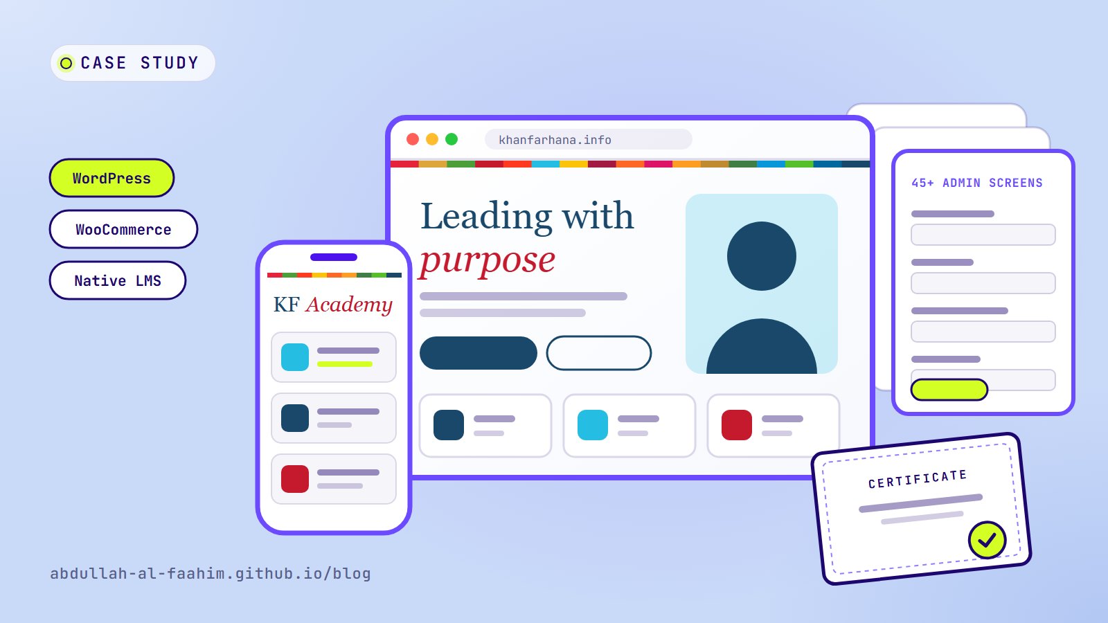
Some websites are a single thing: a shop, a portfolio, a blog. khanfarhana.info had to be five things at once and still feel like one.
Khan Farhana is a youth leader and digital inclusion champion. Her work reaches people through LinkedIn, television, newsletters, a leadership fellowship, public opportunities and, more recently, online courses. Before this project, all of that lived in different places. The website’s job was to bring it under one roof, in one design, and to let her team keep it current without calling a developer for every change.
I handled the whole project: design, front-end, WordPress engineering, the admin experience and SEO. This post walks through how it came together, the decisions that shaped it, and the problems I had to solve on the way. You can also see the visual case study on the site itself.
The brief
The site needed to do a lot:
- A personal-brand homepage with real storytelling, not just a photo and a bio.
- Programme pages that turn interest into applications, starting with the Leadership Fellowship.
- A press room and stories for TV interviews, radio, print features and long-form programme stories.
- An opportunities board that anyone can contribute to.
- A learning platform with payments, where students enrol in free or paid courses and earn certificates.
And one rule sat over all of it: the team must be able to edit everything themselves. Headings, cards, buttons, images, dates, cohort names. If an edit needs a developer, the site slowly goes out of date.
The big decision: one hand-coded theme, no page builder
The usual way to build a site like this in WordPress is to stack a page builder, a theme framework and a dozen plugins: one for courses, one for forms, one for directories, one for SEO. It works on day one. It gets slower and more fragile every time something updates.
I went the other way and built a single hand-written theme: plain PHP, CSS and JavaScript, with WooCommerce for payments and almost nothing else. That choice drove everything that followed:
- Speed. No builder means no builder CSS, no nested wrapper divs and no scripts loaded “just in case”.
- Consistency. Every page uses the same components, so the design can’t drift as the team adds content.
- Control. Nothing breaks because a third-party builder pushed an update.
The trade-off is obvious: everything a builder gives you for free, like editable sections, I had to build myself. That’s where most of the work went, and it’s the part I’m proudest of.
Four goals that shaped every page
- One home for everything. Brand, programmes, press, newsletters, opportunities and courses under one design.
- Run by the team, not a developer. Guided admin fields instead of code.
- Fast on a phone. Most visitors arrive from social media on mobile, so layouts, images and fonts are built mobile-first.
- Easy to find and trust. Clean structured data, breadcrumbs and a summary that AI assistants can read, so search engines and assistants describe the site correctly.
A light, editorial design language
The design is deliberately calm. Airy white layouts, a serif headline with one italic accent word, and a thin rainbow strip borrowed from the UN Sustainable Development Goals that quietly signs every section. It ties the site to the causes Khan Farhana works on without shouting about it.
The palette stays restrained so photos, press cards and programme content do the talking:
| Colour | Hex | Role |
|---|---|---|
| Navy | #19486A |
Primary, headings and buttons |
| Sky | #26BDE2 |
Links and highlights |
| Crimson | #C5192D |
Accents and calls to action |
| Ink | #1A1A2E |
Body text |
Typography is a three-font system, each with a clear job:
- Fraunces for headlines, with its italic used for the single accent word.
- Plus Jakarta Sans for the interface and body text.
- BCC Purno for Bangla, loaded only when Bangla text is actually on the page (more on that below).
The build, page by page
1. A homepage that tells a story
The homepage runs like a short biography: a hero, a “Who am I” section, a scrollable timeline covering a decade of impact, the career journey, impact counters, services and a pinned profile card.
Every one of those blocks has its own admin editor. If a new milestone happens, the team adds it to the timeline. If a number grows, they update the counter. The story can change without touching code.
2. A programme page that drives applications
The Leadership Fellowship page has stats, career tracks, a cohort timeline and an apply flow. It’s fully editable, including the cohort name, dates and call-to-action buttons, so a new intake is an admin task, not a redesign.
3. The Opportunities Hub
This is a searchable directory of jobs, scholarships, fellowships and internships, built as its own content type with categories and deadlines. Three details make it work in practice:
- Visitors can post opportunities through a public form.
- The team moderates submissions from an approval queue in the admin.
- Listings close automatically when their deadline passes, so the board never fills up with dead links.
4. Press and media coverage
TV interviews, radio, print and online features appear as clean cards with the outlet, date and an external link. They’re managed as their own content type, so adding a new feature is a form, not a page edit.
5. Featured stories
Long-form stories of programmes and events, each with its own template, structured data and share tools.
6. A blog with reader submissions
A fast reading experience with categories, search and comments, plus a front-end form that lets guest authors submit posts for review. The community can contribute without needing a WordPress account with editor rights.
7. KF Academy: a learning platform of its own
This was the largest piece. KF Academy lets students and instructors sign in separately, enrol in free or paid courses, learn through lessons, quizzes and assignments, and earn verifiable certificates. Sign-up uses an email one-time password.
It’s built natively in the theme, with no third-party LMS plugin. Under the hood that means instructor and student roles, progress tracking and nine purpose-built database tables, with WooCommerce handling payments.
Built for the phone first
Every page reflows cleanly down to small phones: larger touch targets, stacked layouts, no sideways scrolling, and menus that open in one tap.
Under the hood
An admin built for non-developers
The theme ships with more than 45 admin screens, one for each page and section. Instead of asking editors to remember URLs, every button link has a destination picker: choose a page from a list, or paste a custom link. It sounds small. It removes the most common way editors break a site.
A live ticker for OBS
Khan Farhana also streams. The theme includes a transparent overlay page at /ticker/ that can be added to OBS as a browser source. It re-reads its settings about every 15 seconds, so an edit in the admin reaches a running broadcast without restarting anything. Coming from broadcast engineering, this was a fun crossover to build.
SEO and AI-ready
- Schema.org JSON-LD for Person, Organization, WebSite, breadcrumbs and articles.
- Visible breadcrumbs that always match the markup, so what users see and what search engines read never disagree.
- A
/llms.txtsummary, so AI assistants have a clean, accurate description of who she is and what the site offers.
Performance by design
- Image dimensions and lazy loading are added at render time across the theme.
- CSS and JavaScript are minified.
- The Bangla font loads only when Bangla text is on the page.
Safe to operate
One-click maintenance mode, a branded login screen, one-time data migrations, and demo content that can be imported and removed in one click.
Motion with restraint
Gentle scroll reveals and counters appear only where they help, and they switch off for visitors who prefer reduced motion or have Data Saver turned on.
Problems I ran into, and how I solved them
Every real project has a list like this. These five taught me the most.
1. Garbled apostrophes and ampersands on the homepage. Text in the homepage timeline was being escaped twice on save, so an apostrophe would turn into visible code. I fixed it at the source, then wrote a one-time, repeat-safe migration that cleaned the existing content. Nobody had to retype anything.
2. Images popping in and the page jumping. Many hand-coded images had no width and height, so browsers couldn’t reserve space for them and the layout shifted as they loaded. A small render-time layer now adds dimensions and lazy loading across the whole theme, instead of fixing images one template at a time.
3. Bangla text without a heavy font.
Loading a full Bangla font on every page would slow down the English pages for no reason. BCC Purno is mapped to Bangla characters only, using a unicode-range rule and size-adjust. English keeps its own typeface, the two scripts sit at a matching visual size, and the Bangla font is fetched only when it’s needed.
4. Wide layouts breaking on small phones.
A few grids pushed the page wider than the screen. Grids now use minmax(0, 1fr), long words wrap safely, and horizontal overflow is clipped. Then I checked every template at phone, tablet and desktop widths.
5. Replacing a plugin without losing payments. The course platform started on a third-party LMS plugin and moved to the native one. The risk was breaking checkout for paid courses. The solution: each paid course gets a hidden, synced WooCommerce product, so carts, orders and receipts kept working exactly as before.
The outcome
- One theme, no page builder. Everything on the site is plain, hand-written PHP, CSS and JavaScript. There is nothing to break when a builder updates.
- A team that can run it alone. A 32-page Admin Panel Operation Guide ships with the theme, so new editors can learn every screen.
- Room to grow. New pages, courses, programmes and opportunities are added from the admin. The structure doesn’t change.
What I’d tell anyone building a site like this
- Design the admin as carefully as the front end. The people who edit the site every week are users too. Guided fields and a destination picker did more for the site’s long-term health than any visual flourish.
- Fix problems at the source, then migrate. Patching symptoms template by template leaves landmines. Fixing the cause and running a one-time, repeat-safe migration cleans up the past and protects the future.
- Own the critical paths. Payments and courses are the parts that hurt most when they break. Building the LMS natively, with WooCommerce only where it’s strongest, made those paths predictable.
- Write the manual. A site the client can’t operate is a site that stops changing. The operation guide is part of the deliverable, not an extra.
Visit the live site at khanfarhana.info, and see the screens in the visual case study. If you need a site that your own team can run, get in touch.
Broadcast engineer at Channel i, brand and social media designer, and maker of offline-first apps for Bangladesh.
See my work