Logos With a Second Meaning: FedEx, Amazon, Baskin-Robbins, Toblerone and Why Hidden Symbols Work
An arrow between two letters. A smile that points from A to Z. A number hidden in initials. Why the best hidden symbols in logos work, and how to use negative space in your own designs without making a puzzle.

After reading this, you’ll understand why hidden symbols in logos work, and how to use negative space in your own marks without turning them into riddles.
This is part of my Logo Autopsy series. Logos belong to their owners; I describe them here for commentary and link to official sources rather than reproducing them. The diagrams are my own abstract examples.
Photo by tookapic on Pixabay (Pixabay Content License).
Why it matters
Most people see a logo for less than a second. A hidden symbol rewards a second look, and the moment someone notices it (“I never saw the arrow!”) they remember the brand and often tell someone else. Done well, the hidden element also reinforces the brand’s message. Done badly, it’s a clever trick nobody needs.
The idea explained
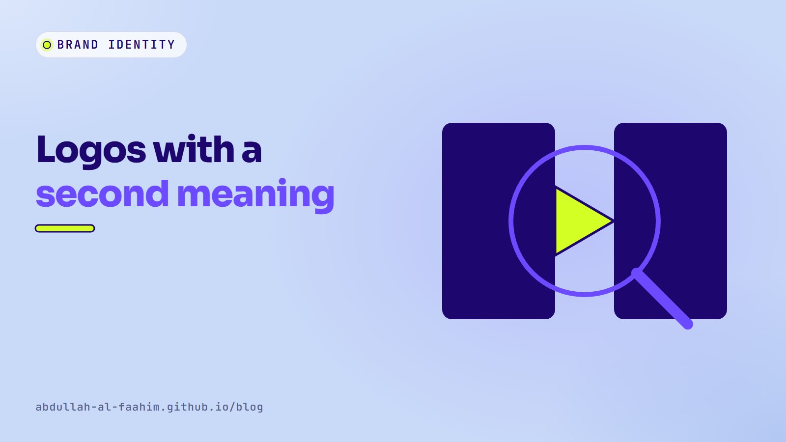
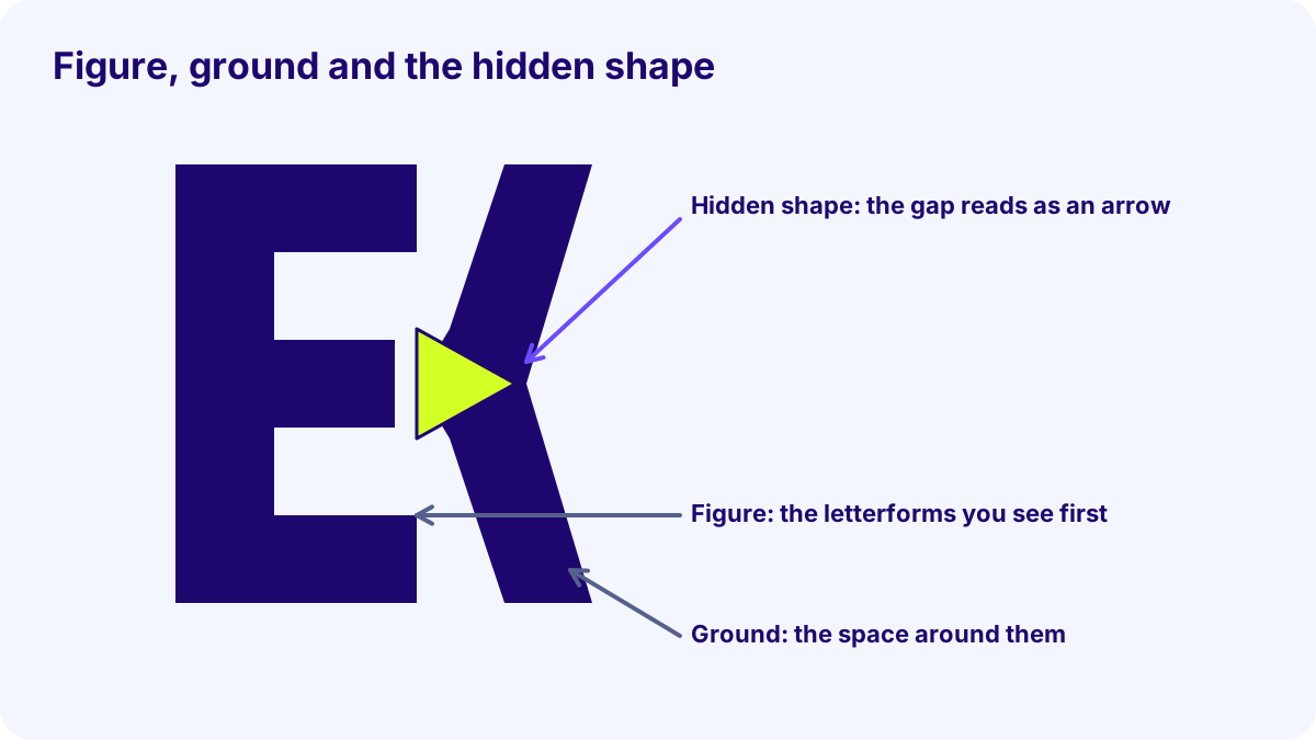
Hidden symbols usually rely on figure/ground: our brain separates shapes (figure) from the space around them (ground). When the ground itself forms a meaningful shape, the logo carries two messages at once.
Four well-known examples show the main techniques:
- FedEx (negative space). The wordmark, designed by Lindon Leader at Landor in 1994, hides a right-pointing arrow between the “E” and the “x”, suggesting speed and direction. The arrow is never outlined; it’s simply there once you notice it.
- Amazon (a symbol with two jobs). The orange curve under the wordmark, introduced in 2000, reads as a smile and also points from the “a” to the “z”, hinting that the store sells everything from A to Z.
- Baskin-Robbins (a hidden number). In the 2000s identity, the pink parts of the “BR” monogram form the number 31, a reference to the brand’s long-running “31 flavours” idea.
- Toblerone (a hidden animal). The mountain in the logo contains a bear in its negative space, a nod to the Swiss city of Bern, whose symbol is a bear. In 2023 the packaging was redesigned and the Matterhorn image replaced after part of production moved outside Switzerland, which shows that even hidden meanings depend on the brand’s context.
(As with any widely shared design story, check the official brand pages linked below before quoting dates.)
A real example
What makes these work, and what makes many imitations fail? Compare a hidden symbol that supports the message with one that’s only clever:
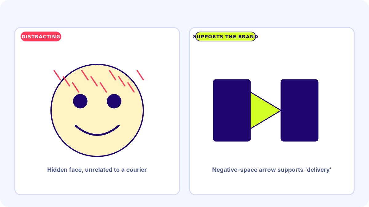
The successful ones share four qualities:
- The logo works without the secret. FedEx is a clean, readable wordmark even if you never see the arrow.
- The hidden element supports the brand promise: speed, choice, variety, origin.
- It’s simple. One idea, not three.
- It survives small sizes, or at least doesn’t hurt legibility when the detail disappears.
Try it yourself
- Write down the one idea your brand should communicate (fast, local, growing, safe).
- Find a simple symbol for that idea (arrow, leaf, house, shield).
- Set your brand name or initials in a few typefaces, and look at the spaces between and inside letters. Could any of them become that symbol with small adjustments?
- Test with five people. Show the logo for two seconds. Ask what they saw. Then ask if they notice anything else.
- If nobody can read the name, simplify. Legibility wins.
Common mistakes
- Forcing it. Bending letters until they’re hard to read just to hide a symbol.
- Hiding something unrelated to the brand. Clever, but meaningless.
- Too many secrets. One hidden idea is memorable; three are noise.
- Ignoring small sizes. Check the logo at favicon size.
- Accidental hidden shapes. Always look at the negative space for shapes you didn’t intend.
Summary
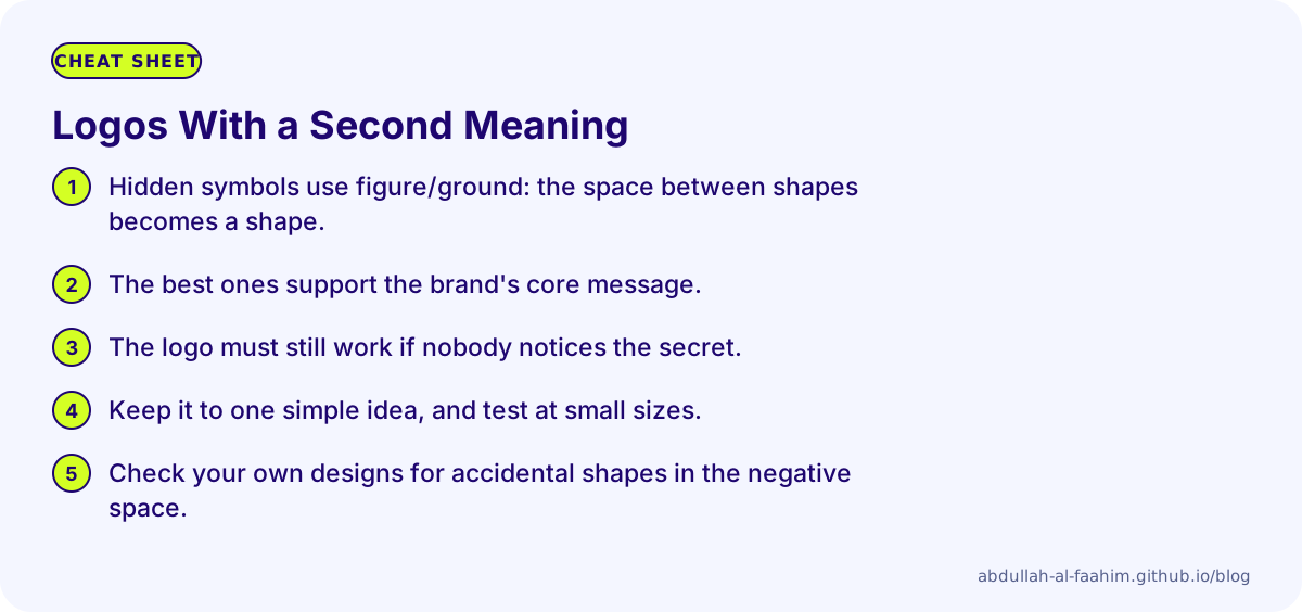
- Hidden symbols use figure/ground: the space between shapes becomes a shape.
- The best ones support the brand’s core message.
- The logo must still work if nobody notices the secret.
- Keep it to one simple idea, and test at small sizes.
- Check your own designs for accidental shapes in the negative space.
Sources and image credits
- FedEx brand and newsroom; Lindon Leader’s design story has been widely published, including in interviews with design publications.
- Amazon brand guidelines and trademarks.
- Baskin-Robbins and Toblerone official sites.
- All logos are trademarks of their owners. They are described here for commentary only and are not reproduced. Diagrams are my own abstract examples.
Broadcast engineer at Channel i, brand and social media designer, and maker of offline-first apps for Bangladesh.
See my work