Designing Bilingual Brands: Setting Bangla and English Together
Why Bangla and English type rarely match out of the box, and the practical rules I use to make them feel like one brand.

Most brands in Bangladesh speak two languages. The logo might be in English, the Facebook posts in Bangla, the event banner in both. Yet in many identities the Bangla side is an afterthought: a default font dropped in at the last minute, sitting awkwardly next to a carefully chosen English typeface.
When Bangla and English are designed together, the brand feels confident and local. When they aren’t, it looks like two brands sharing a page. These are the rules I follow to make them work as one.
Why the two scripts don’t match by default
Latin and Bangla are built on different structures, and you can see it the moment you put them side by side.
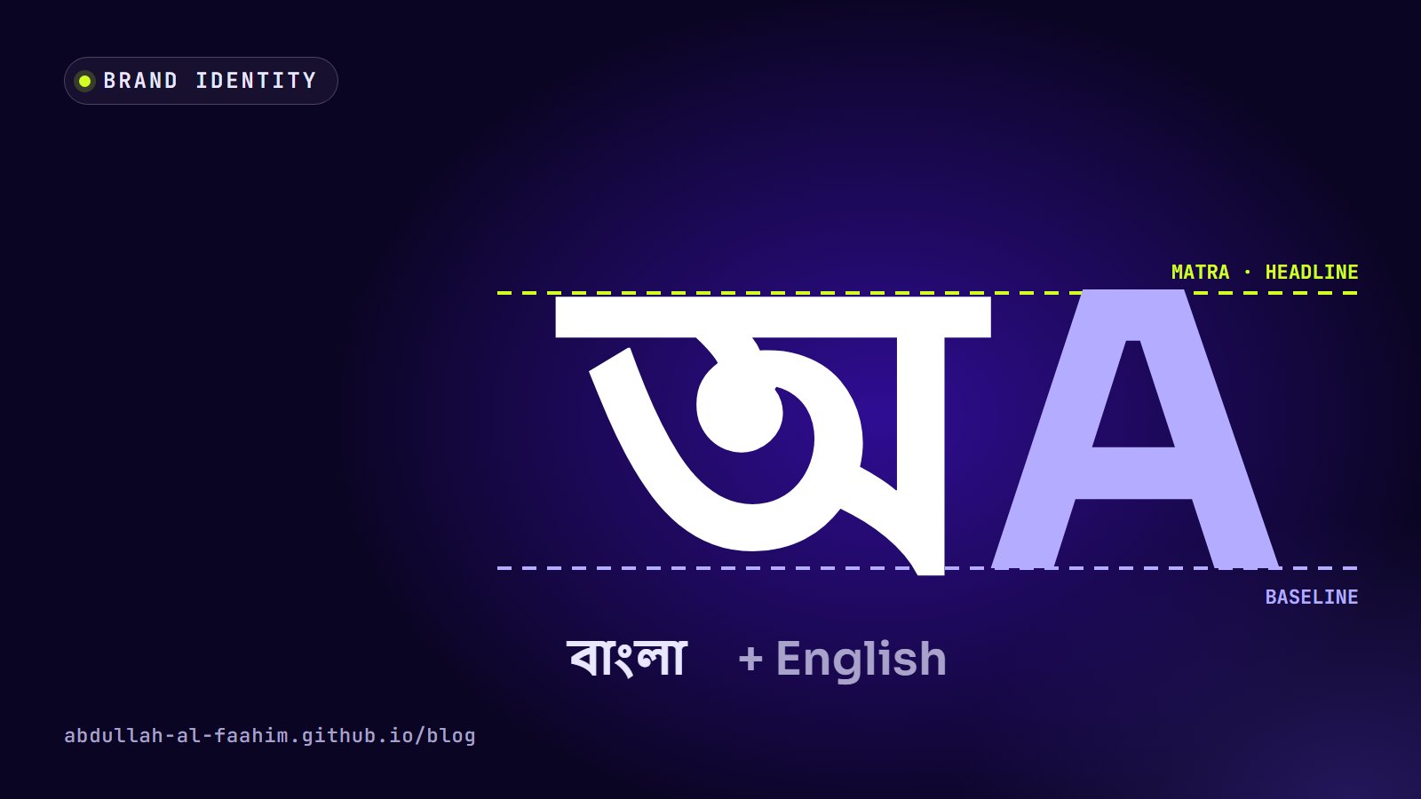
- Different anchor lines. Latin letters sit on a baseline. Bangla letters hang from a headline, the horizontal stroke called the matra that runs along the top of most letters.
- Different vertical extent. Bangla has vowel signs that sit above the headline and below the letters, and conjuncts (যুক্তবর্ণ) can stack consonants vertically. A line of Bangla needs more vertical room than a line of English.
- Different apparent size. At the same point size, Bangla often looks smaller than Latin text, because much of its height is taken up by marks above and below the main letters.
- Different stroke logic. Many Latin typefaces are geometric or humanist; Bangla typefaces have their own traditions, from calligraphic to modern geometric. A perfect match rarely exists.
So “use the same size and spacing for both” almost never works.
Rule 1: pick typefaces as a pair
I choose the Bangla and English typefaces together, looking for shared qualities rather than identical shapes:
- Similar stroke contrast. A low-contrast, even-stroke Latin typeface pairs better with a low-contrast Bangla one.
- Similar weight range. If headlines use a bold weight in English, the Bangla typeface needs a genuinely bold weight too, not a faked one.
- Similar personality. Rounded and friendly with rounded and friendly; sharp and technical with sharp and technical.
Some typeface families are designed for both scripts, such as Noto Sans and Noto Sans Bengali or Hind and Hind Siliguri, which makes matching much easier. For more distinctive brands, I pair a characterful English typeface with the Bangla face whose rhythm feels closest, then adjust size and spacing by eye.
Rule 2: always use Unicode fonts
Many people in Bangladesh learned to type Bangla with Bijoy, and older documents often use ANSI fonts such as SutonnyMJ, where Bangla letters are mapped onto Latin character codes. Those files look right on the designer’s computer but break everywhere else: text turns into Latin gibberish when the font is missing, can’t be searched, and won’t survive being pasted into a website or app.
For anything digital, I insist on Unicode Bangla fonts. Text stays readable on every device, works with screen readers and search engines, and can be copied, translated and indexed. (I built a small Bijoy typing practice page for people learning the layout, but the text it produces should still end up in Unicode.)
Rule 3: match apparent size, not point size
When Bangla and English sit next to each other, as in a bilingual headline or a logo with both names, I adjust sizes until they look equal. In practice that often means setting the Bangla a little larger than the English, then checking by eye at the final size.
The test is simple: squint. If one language jumps out as bigger or heavier, adjust until neither dominates (unless one is meant to).
Rule 4: give Bangla more line height
Line height that looks comfortable for English can make Bangla feel cramped, and in tight layouts it can even clip vowel signs above or below the line. I set Bangla body text with more generous line height than English, and I test the tallest conjuncts and the deepest marks in the real typeface, not just a sample sentence.
In apps this matters even more. A button or list row with a fixed height that fits English may cut off Bangla. I design components to grow with their text instead of fixing heights to the English version, as I described in Building Offline-First Apps for Bangladesh.
Rule 5: align to what each script respects
In a bilingual logo or lockup, I have to decide which lines to align. Aligning the English baseline with the bottom of the Bangla letters can look fine; aligning the top of the English capitals with the Bangla headline often looks even better, because the matra creates a strong visual line.
There’s no universal answer. I try both alignments, look at them at the size they’ll be used, and pick the one where the two names read as one unit.
Rule 6: decide the hierarchy
When both languages appear, one usually leads. For a local community organisation, Bangla might lead and English support. For a tech company working with international partners, the reverse. Making this decision explicit, and writing it into the brand guidelines, prevents every new banner from reinventing it.
Common patterns I use:
- Bangla primary, English secondary: the Bangla name larger, the English name smaller underneath.
- Equal weight: both names at matched apparent size, separated by a clear divider or placed side by side.
- Context switch: Bangla for local social media, English for international documents, with the same layout system for both.
Rule 7: numbers, dates and punctuation
Bilingual brands also need rules for the small stuff:
- Digits: use Bangla digits (০–৯) in Bangla text and Latin digits in English text, consistently.
- Dates: decide whether Bangla materials use the Bangla calendar, the Gregorian calendar, or both.
- Punctuation: Bangla uses the দাঁড়ি (।) as its full stop. It’s a small detail, but getting it wrong is noticeable to every native reader.
- Currency: ৳ for taka, with consistent spacing and grouping.
Rule 8: put it in the guidelines
All of this disappears if it lives only in my head. A bilingual brand guideline should include:
- the Bangla and English typefaces, with weights for each role
- the size relationship between them (for example, “Bangla headlines one step larger”)
- line height for each script
- examples of correct bilingual lockups and headlines
- digit, date and punctuation rules
I treat this as part of the brand identity process I described in Brand Identity Is More Than a Logo.
Designing for the audience you actually have
Treating Bangla as a first-class part of a brand isn’t just good typography. It’s respect for the people the brand is speaking to. Most of them read Bangla first. A brand that clearly took the time to get Bangla right earns trust that an English-only identity, or a careless translation, never will.
Broadcast engineer at Channel i, brand and social media designer, and maker of offline-first apps for Bangladesh.
See my work