Brand Identity Is More Than a Logo: A Practical Process for Small Organisations
The step-by-step process I use with startups, youth organisations and shops to go from a vague brief to an identity people can actually use.

When a small organisation asks for “a logo”, they almost always need more than one. They need a way to look consistent across a Facebook page, a banner at an event, a business card and a pitch deck, usually made by different people with different tools.
That’s what a brand identity is: not a single mark, but a system that lets anyone produce something that clearly belongs to the same organisation. Over the years I’ve designed identities for youth organisations, tech communities, fashion labels and retailers. This is the process I use, scaled for teams that don’t have a marketing department.
1. Start with questions, not sketches
The most expensive mistake in branding is designing before you understand the problem. Before I open Illustrator, I want answers to a short list of questions:
- Who is this for? Not “everyone”. The two or three groups whose opinion really matters.
- What should they feel? Three or four words, such as “trustworthy, modern, local”, work better than a paragraph.
- What makes you different? If you swapped your name with a competitor’s, what would be wrong?
- Where will the brand live? Social media, signage, packaging, uniforms, an app? This decides which formats matter most.
- What exists already? Old logos, colours people already associate with you, things the team loves or hates.
I write the answers up as a one-page brief and get the client to agree to it. Later, when opinions clash, the brief is the referee.
2. Research the space
Next I look at the people the brand will stand next to: competitors, similar organisations, and the visual habits of the sector. If every education initiative uses blue and a graduation cap, a new one can either fit the category deliberately or stand out deliberately. Both are valid, as long as the choice is conscious.
I collect references into a single board and mark what to avoid as clearly as what to aim for. Clients often find the “avoid” list more useful.
3. Concept before polish
I sketch broadly before committing to anything. A good logo usually comes from one clear idea: a letterform, a symbol tied to what the organisation does, or a shape that captures its personality.
I usually present two or three distinct directions, not ten variations of the same one. Each direction gets a short rationale explaining the idea behind it. Clients choose better when they’re comparing ideas rather than shades of the same shape.
4. Build the mark properly
Once a direction is chosen, the craft begins:
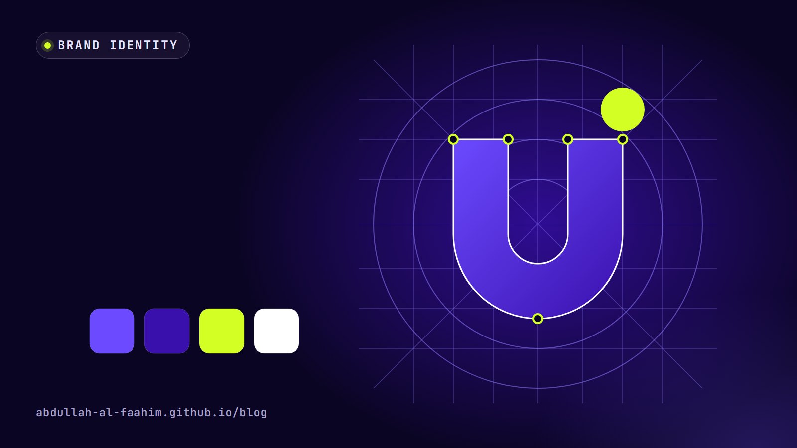
- Construction. I rebuild the mark on a grid so curves, angles and spacing are consistent. Construction grids aren’t decoration; they make the mark feel intentional and easier to redraw.
- Small sizes. The logo must work as a 32-pixel favicon and a social profile picture, so I test it tiny early and simplify details that disappear.
- One colour. It must work in solid black, solid white and a single brand colour, for stamps, embroidery, engraving and photocopies.
- Variations. A full lockup with the name, a compact version, and an icon-only mark for tight spaces.
5. Colour and type, chosen as a system
A logo alone doesn’t make an identity. Colour and typography do most of the everyday work.
Colour. I pick a primary colour, a supporting palette and usually one accent. Then I check contrast so text stays readable (WCAG’s 4.5:1 for normal text is a good baseline), and I define exact values for screen (HEX and RGB) and print (CMYK, and Pantone where it matters). Print colours can look very different from screen colours, so I always check a printed proof when the budget allows. I describe how I build a colour scale in more detail in Building a Personal Design System from One Colour.
Typography. I choose one or two typefaces with clear roles: one for headlines, one for body text. For organisations in Bangladesh, the Bangla typeface needs as much attention as the English one, and the two have to feel like they belong together. I wrote about that in Designing Bilingual Brands.
6. Show it in use
A logo on a white artboard tells you almost nothing. Before handover, I show the identity applied to the places it will actually live:
- social media post templates and profile images
- an event banner or standee
- business cards, letterheads and envelopes
- a presentation title slide
- merchandise like T-shirts, if the organisation uses them
Mock-ups catch real problems: a tagline too long for a banner, a colour that vibrates on screen, a logo that disappears on a busy photo.
7. Write guidelines people will read
Brand guidelines fail when they’re 60 pages nobody opens. For small organisations, I aim for something short and practical:
- The logo: versions, minimum size, clear space, and a page of “don’ts” (no stretching, no recolouring, no drop shadows).
- Colours: exact values for screen and print, with examples of good combinations.
- Typography: which typefaces to use for what, with sizes for common formats.
- Templates: ready-to-edit files for the things the team makes most often.
Templates matter more than rules. A volunteer with ten minutes before an event will use a ready social post template; they won’t read a rulebook.
8. Hand over files that work
The final package should let the client work without coming back to me for every small job:
- logos in SVG, PDF and high-resolution PNG, in full colour, black and white
- colour values in one easy-to-copy document
- font names and where to get them
- editable templates (Figma, Illustrator, PowerPoint or Canva, depending on what the team uses)
- the guidelines as a PDF
I organise them in clearly named folders. “Logo_final_FINAL2.png” has no place in a brand handover.
Common mistakes I see
- Starting with “make it pop”. Without a brief, feedback becomes personal taste.
- Too many colours. Most small brands need one main colour, one or two supporting colours and neutrals.
- A logo that only works big. If it fails at profile-picture size, it fails where most people will see it.
- No templates. Without them, every new post becomes a fresh design, and the brand drifts within months.
- Ignoring the second language. A beautiful English wordmark paired with a default Bangla font looks unfinished.
Brand is what people do with it
The identity I hand over is only the beginning. A brand becomes real when the team uses it consistently, week after week, on every post and every banner. My job is to make that easy: a clear idea, a solid system, and tools simple enough that people actually use them.
Broadcast engineer at Channel i, brand and social media designer, and maker of offline-first apps for Bangladesh.
See my work