Design Theory You Can Use Tomorrow: Gestalt, Hierarchy and Simple Research
The handful of design principles and research methods I actually use every week, explained without the jargon.

There’s a gap between design theory as it’s taught and design as it’s practised. Theory can feel abstract: lists of principles, laws named after psychologists, diagrams of eyes scanning pages. Practice is a deadline and a client asking why the poster “doesn’t feel right”.
The good news is that a small amount of theory goes a long way. These are the principles and research methods I actually reach for, with examples of how each one changes a real design.
Gestalt: how people group what they see
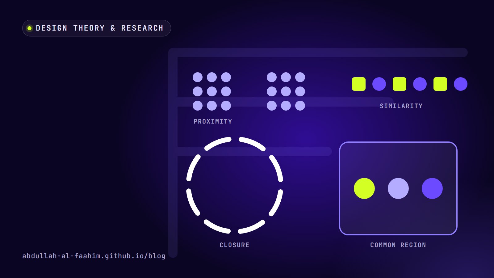
Gestalt psychology describes how our brains organise visual information into groups and wholes. You don’t need to memorise every principle, but five of them explain most layout problems.
Proximity
Things that are close together are seen as related. This is the single most useful principle in layout. If a caption is the same distance from the image above it and the paragraph below it, readers can’t tell which one it belongs to. Tighten the space to what it belongs to, loosen the space to everything else.
In practice: on event posters, group the date, time and venue tightly into one block, separated clearly from the speaker names. People will read it as “the details” at a glance.
Similarity
Things that look alike are seen as the same kind of thing. Consistent colour, shape or style signals a category. That’s why all buttons in a system should look like buttons, and why a link styled differently on one page confuses people.
Common region
Things inside the same boundary, such as a card, a box or a background colour, are seen as a group, even if they’re not especially close. Cards work because of common region.
Closure and continuity
We complete incomplete shapes and follow smooth lines. Logo designers use closure all the time, letting the viewer fill in a missing piece of a letter or symbol. Continuity explains why aligned edges feel calm: the eye travels along them.
Figure and ground
We separate what’s in front (figure) from what’s behind (ground). When figure and ground compete, as with text over a busy photo, the design feels noisy. A darkened overlay, a solid band or simply a calmer image restores the separation.
Visual hierarchy: deciding what’s seen first
Every layout answers the question “what should people notice first, second and third?” If you don’t answer it deliberately, the layout answers it for you, usually badly.
The tools of hierarchy are simple:
- Size: bigger is seen first.
- Contrast: high-contrast elements stand out against low-contrast ones.
- Colour: a single accent colour draws the eye. This is why my own design system allows only one highlight colour, Acid Lime, and uses it sparingly.
- Position: in left-to-right languages, people tend to start top-left.
- Space: an element surrounded by empty space feels important.
A quick check: blur your design (or step back and squint). The shapes you still see are your hierarchy. If the most important message isn’t among them, the design needs work.
A few useful “laws”
Two more principles are worth knowing because they turn directly into design decisions.
Fitts’s law says the time to reach a target depends on its size and distance. On a phone, that means primary actions should be large and easy to reach with a thumb. It’s why the main buttons on this site stretch to full width on phones.
Hick’s law says decision time grows with the number of choices. Long menus and crowded dashboards slow people down. Grouping related items, for example putting experience, awards and tools under one “About” menu, keeps the main navigation short and easy to scan.
These aren’t rules to obey blindly, but they’re good arguments when you need to explain a design decision to a client.
Research doesn’t have to be expensive
Theory tells you how people tend to see things. Research tells you how your audience actually behaves. Many designers skip research because it sounds slow and costly. Most of the useful methods are neither.
The five-second test
Show someone a design for five seconds, then hide it and ask: what was this about? What do you remember? Who is it for? It’s a fast way to check whether a poster, landing page or social post communicates its main message. If people can’t tell you the event name after five seconds, the hierarchy needs fixing.
Quick usability tests
Give a few people a realistic task (“record a 500 taka expense from bKash”) and watch them try it without helping. Jakob Nielsen’s well-known argument is that testing with around five users reveals most of the major usability problems in a design, and that several small rounds beat one big study. In my experience, the first two or three people already reveal the problems that matter most.
Tips that make it work:
- Ask people to think out loud.
- Don’t explain the interface; watch where they hesitate.
- Write down what they do, not just what they say.
Surveys, used carefully
Surveys are good for understanding patterns across many people and bad for understanding why. I co-authored a study on public reactions to the November 2025 earthquake in Bangladesh, based on 110 survey responses, and the experience taught me how much the wording of each question shapes the answers. Keep questions neutral, avoid asking two things at once, and pilot the survey with a few people before sending it widely.
Interviews
Short conversations with real users, focused on their past behaviour (“tell me about the last time you tracked your spending”) rather than hypotheticals (“would you use an app that…?”), reveal motivations and context that no survey will.
Card sorting
For navigation and information architecture, give people cards with your content topics and ask them to group them in ways that make sense. It shows you how your audience expects things to be organised, which is often different from how your team thinks about them.
Putting theory and research together
A typical project for me looks like this:
- Brief and questions to understand what success means.
- Quick research such as a few interviews, a look at competitors, maybe a short survey.
- Design using principles: Gestalt for grouping, hierarchy for emphasis, Fitts and Hick for interaction.
- Test early with a five-second test or a small usability session on a rough version.
- Revise and test again before polishing.
Theory gives you a starting point that’s probably right. Research tells you where it’s wrong for these particular people. Together, they turn “I think this looks good” into “this works, and here’s why”.
Further reading
If you want to go deeper, the classic starting points are Don Norman’s The Design of Everyday Things for how people understand objects and interfaces, and Steve Krug’s Don’t Make Me Think for practical, low-cost usability testing. Both are short, readable and still relevant decades after they were first published.
Broadcast engineer at Channel i, brand and social media designer, and maker of offline-first apps for Bangladesh.
See my work