Building a Personal Design System from One Colour
How one violet, one highlight colour and two typefaces became the rules behind my website, GitHub profile, CV and apps.

Design systems are usually discussed as something big companies build: hundreds of components, a dedicated team, a documentation site. But the idea works at any size. Even a single designer benefits from a small set of rules that decide things once, so you don’t decide them again on every project.
Everything you see on this site, my GitHub profile, my CV and my app pages comes from one small system. It started from a single colour. This post explains how it’s built and why each rule exists.
Why bother with a system for one person
I work across very different surfaces: a portfolio website, a GitHub profile made of SVG cards, social posts, presentation decks, app interfaces, even broadcast graphics. Without a system, each one drifts. The violet gets slightly different, a new typeface sneaks in, buttons change shape.
A system gives three things:
- Recognition. People start to associate a colour and a type pairing with your work.
- Speed. You stop agonising over choices that were already made.
- Consistency across tools. The same tokens can drive CSS, Figma styles and generated graphics.
Step 1: choose one base colour
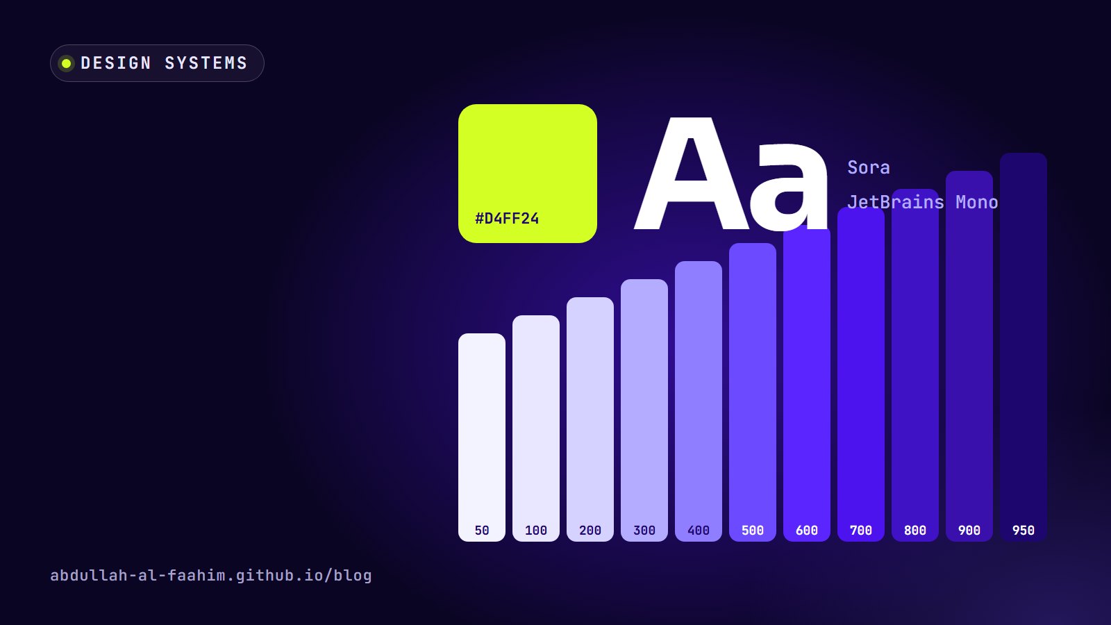
My base is a deep violet, #3A10AD. I wanted something that felt confident and a little technical, stood apart from the usual corporate blues, and worked on both light and dark backgrounds.
From that one colour I built a full scale, from almost white to almost black:
| Token | Hex | Typical use |
|---|---|---|
| brand-50 | #F3F2FF | Tinted backgrounds |
| brand-300 | #B4ADFF | Accents on dark backgrounds |
| brand-500 | #6B4AFF | Primary buttons, links, highlights |
| brand-900 | #3A10AD | The anchor colour |
| brand-950 | #1E066F | Deep backgrounds, dark sections |
The steps in between fill in the gaps for hover states, borders and subtle fills. The key is that every violet anywhere in my work comes from this scale. No one-off purples.
Step 2: one highlight, used sparingly
Next to the violet sits Acid Lime, #D4FF24. It’s loud on purpose. The rule is that lime is a highlight only: one call-to-action button, a key word in a headline, an availability badge. Never a background for long text, never a second brand colour.
The scarcity is what makes it work. If everything is highlighted, nothing is. On this site, lime marks “Hire me”, the first name in the hero, and small status dots. Your eye goes to those things first, which is exactly where I want it.
Step 3: two typefaces with clear jobs
- Sora for display and body text. It’s geometric and modern without feeling cold, and it reads well at small sizes.
- JetBrains Mono for labels, tags, dates and anything technical. Monospace text signals “metadata” and gives the system a subtle engineering flavour that fits my background.
Two typefaces, two jobs. Headlines and paragraphs in Sora; eyebrows, chips and version numbers in JetBrains Mono. That’s the entire typography system, and it covers almost everything.
Step 4: check contrast with numbers, not eyes
A colour system isn’t finished until it passes accessibility checks. WCAG asks for a contrast ratio of at least 4.5:1 for normal text and 3:1 for large text.
Some of the pairings in my system:
- White text on brand-500 (#6B4AFF) is about 5.2:1, which is enough for button labels.
- White on brand-900 (#3A10AD) is about 11.3:1.
- Brand-950 (#1E066F) text on lime (#D4FF24) is about 13.8:1, so lime buttons use dark violet text.
- Lime on white is only about 1.2:1, which is why lime never appears as text on a light background.
That last number is the reason for a rule that might otherwise feel arbitrary. Systems are full of rules like that: they look like taste, but they’re backed by measurements.
Step 5: turn decisions into tokens
The rules only become a system when they’re written down in a form tools can use. On this site, every colour is a CSS custom property:
:root {
  --brand-500: #6b4aff;
  --brand-900: #3a10ad;
  --lime: #d4ff24;
  --on-lime: #1e066f;
  --canvas: #ffffff;
  --ink: #160a45;
  --mark: var(--brand-600);
}
Components never use raw hex values. A button uses --brand-500, body text uses --ink, a highlight uses --lime. That indirection is what makes dark mode possible.
Step 6: light and dark from the same tokens
Dark mode isn’t a second design. It’s the same tokens pointing at different values. In dark mode, --canvas becomes a near-black violet, --ink becomes a soft off-white and --mark shifts from brand-600 to the lighter brand-300 so it stays readable. Components don’t change at all.
The same thinking applies outside the browser. The SVG cards on my GitHub profile come in light and dark versions generated by a small script, using the same token values and with the Sora and JetBrains Mono fonts embedded. GitHub shows the right one based on the viewer’s theme.
Step 7: a few components, not a library
My “component library” is small:
- Buttons: primary (violet), highlight (lime), ghost and outline. Fully rounded.
- Cards: a surface colour, a thin border, a 20px radius and a soft violet-tinted shadow.
- Chips and tags: small, rounded, set in JetBrains Mono.
- Section headers: a mono eyebrow, a divider line and a large Sora headline with one highlighted phrase.
Four or five patterns repeated consistently feel more designed than fifty patterns used once each.
Keep the system somewhere safe
I keep the full system, including tokens, type specimens, component notes and usage rules, as a single source of truth, separate from any one project. When I change a rule, I change it there first, then update the projects that use it. That stops the system from slowly forking into versions.
Start smaller than you think
If you want a personal design system, don’t start with components. Start with:
- One base colour and a tonal scale.
- One highlight colour with a strict rule for when it’s allowed.
- Two typefaces with clear jobs.
- Contrast checks for every text and background pair you use.
- Tokens so every tool reads the same values.
That’s enough to make everything you produce feel like it came from the same place. For how a system like this grows into a full brand for a client, see Brand Identity Is More Than a Logo.
Broadcast engineer at Channel i, brand and social media designer, and maker of offline-first apps for Bangladesh.
See my work